Most Effective Banner Designs and CTAs for eCommerce
Website banners are one of the most important ways you can garner traffic to your eCommerce website.
Once you have grabbed the attention of your target audience and made them visit your website, the very next step for you is to make them believe in your services and business. It is important to understand your user’s behavior when they visit your website. For example, if they made the visit to your online store anticipating more information about product/services to provide them that at first. If they are looking to try out your services, do come up with interactive CTAs that influence their decision to sign up.

An effective call to action is an integral part of eCommerce as it helps in generating leads. Having well strategized CTAs will make your website audience think about giving a try to your services/products.
These are some of the best examples of effective CTAs that are generating a lot of leads for these online businesses:
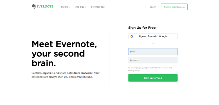
Evernote: Meet Evernote, Your Second Brain
Evernote is an online application to take notes anytime anywhere. They have used a sign-up form with a button “Sign up for free” on their website’s homepage. And they use this headline on their banner which is curated very strategically to explain what they do in just a few words – “Meet Evernote, Your Second Brain”. The design of this template makes it extremely easy for visitors to understand the navigation and overall look and feel of the website.
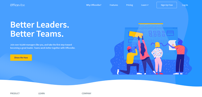
OfficeVibe: Better Leaders. Better Teams.
OfficeVibe is an online platform for you to take regular feedback from your teams on how do they feel about their job responsibilities, working environment, etc. Officevibe exactly tries to convey that message with its banner headline – “Better Leaders. Better Teams.”. The banner comes with a yellow button with a text – “Show me how” written on it, which insists the visitor to click on it to know how it can help them to be a better leader.
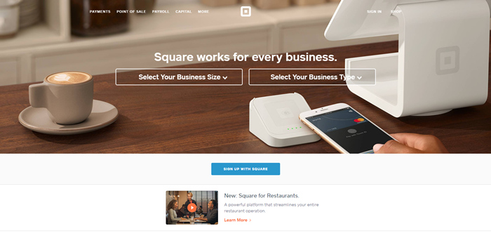
Square: Square works for every business
Square is a credit card payment processing service provider which allows you as an online business to accept credit card payments from anywhere in the world. And this is the exact message you get from their banner and CTA which properly conveys the message that their service works for every business.
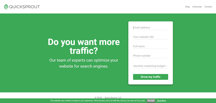
QuickSprout: Do you want more traffic?
QuickSprout is a content marketing and strategy making guide which is widely popular among internet marketers. As soon as you land on their page, they greet you with this line on their banner – “Do you want more traffic?.” And who doesn’t want more traffic to their website? Then the sign-up button says – Grow my traffic, another way to pull the attention of the user and increase their curiosity.


